Scatter函数是一个强大的画散点图函数:
1 | matplotlib.pyplot.scatter(x, y, s=None, c=None, marker=None, cmap=None, norm=None, vmin=None, vmax=None, alpha=None, linewidths=None, verts=None, edgecolors=None, *, data=None, **kwargs) |
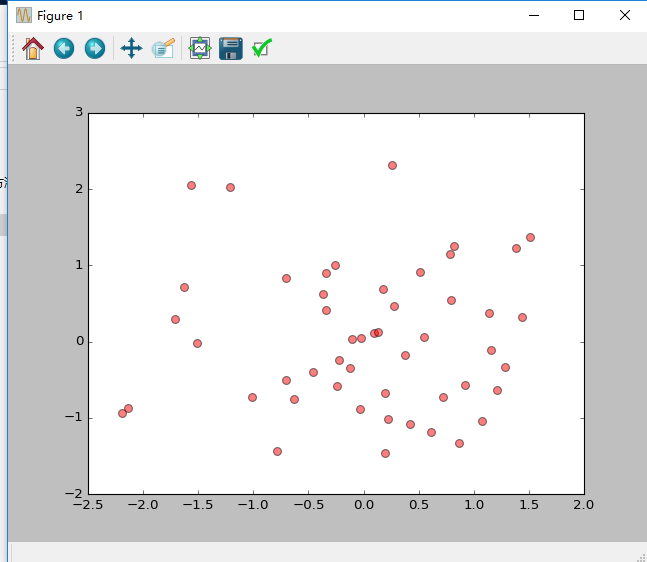
一、画散点图(一)
1 | #散点图 |
二、画散点图(二)
1 | #导入必要的模块 |

Scatter函数是一个强大的画散点图函数:
1 | matplotlib.pyplot.scatter(x, y, s=None, c=None, marker=None, cmap=None, norm=None, vmin=None, vmax=None, alpha=None, linewidths=None, verts=None, edgecolors=None, *, data=None, **kwargs) |
一、画散点图(一)
1 | #散点图 |
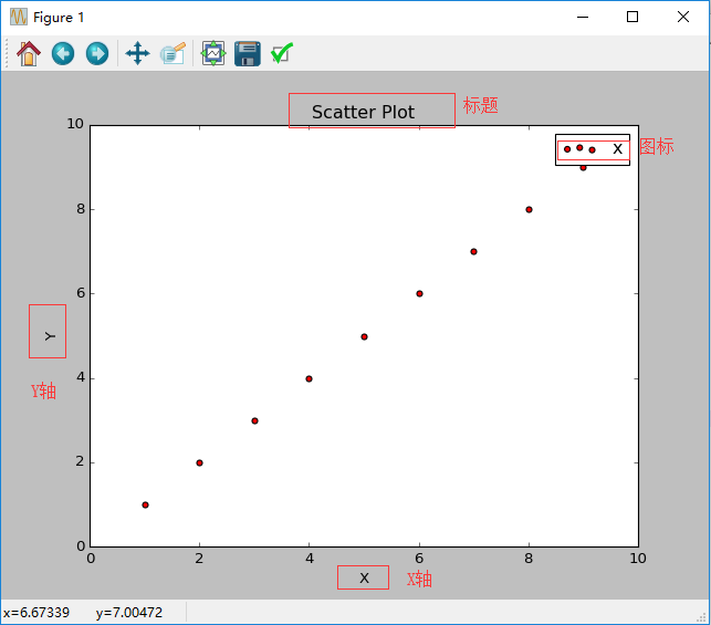
二、画散点图(二)
1 | #导入必要的模块 |